The Project
We set out to streamline Sylvera’s navigation, making it more intuitive, scalable, and efficient. The goal was to enhance product discoverability, improve usability, and reduce design debt, ensuring users could access key features faster and more effectively.
The Solution
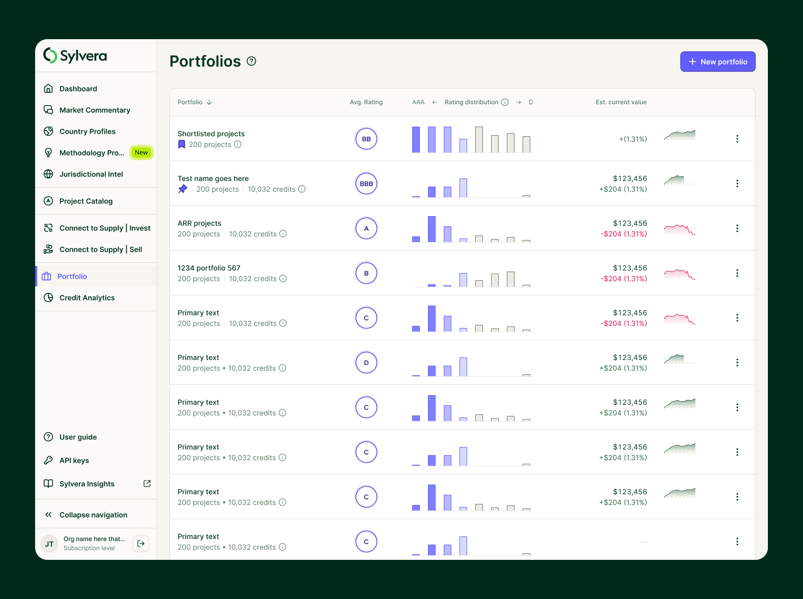
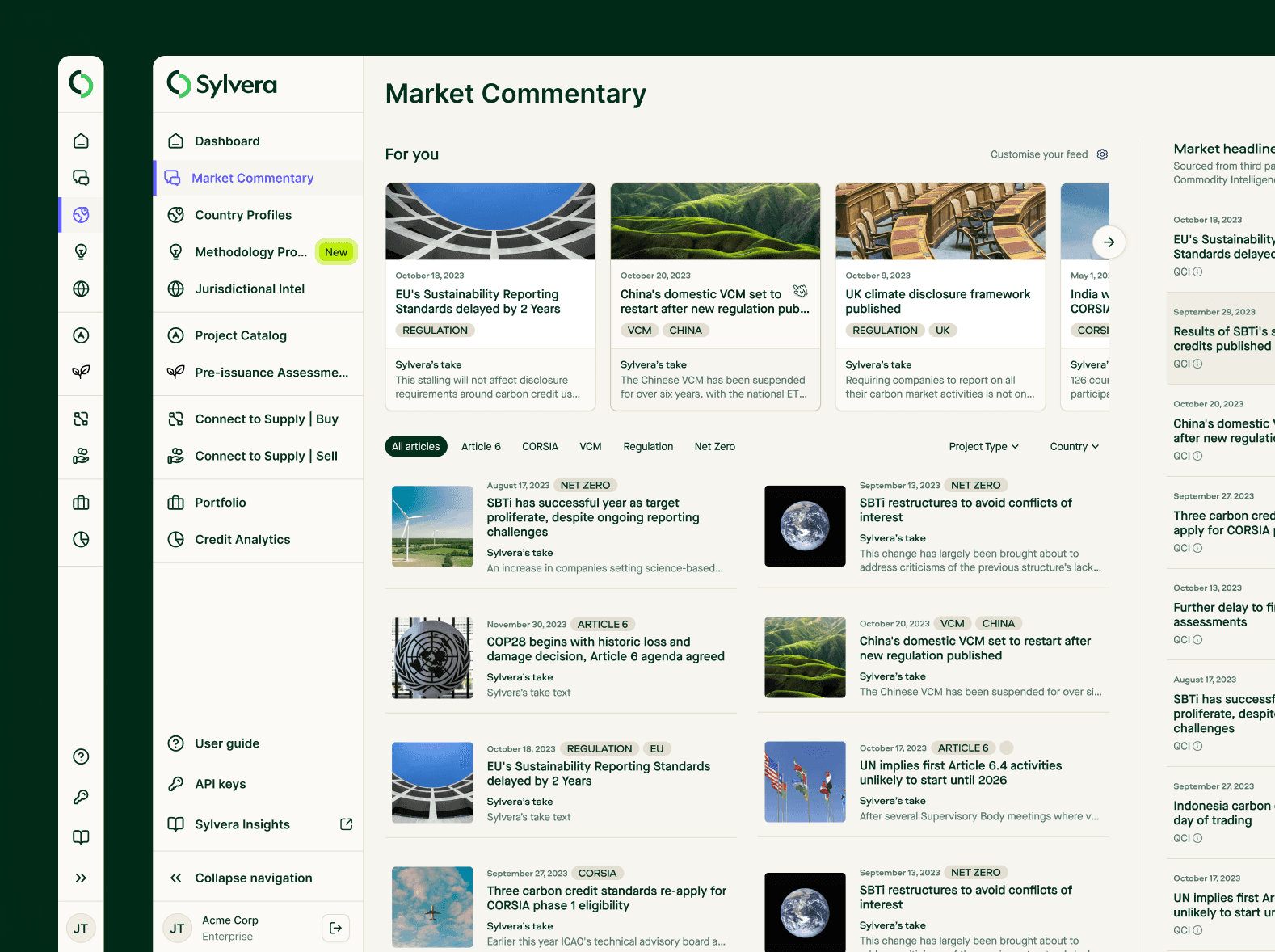
We introduced a persistent side navigation, allowing for seamless navigation across all pages while decluttering the dashboard. Working closely with engineering, we integrated design tokens to enhance consistency, accessibility, and scalability, ensuring a cohesive user experience across the platform.
Existing experience
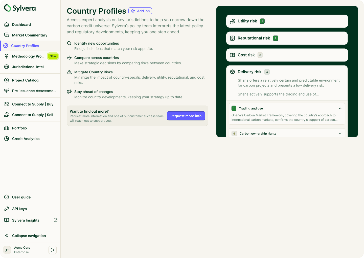
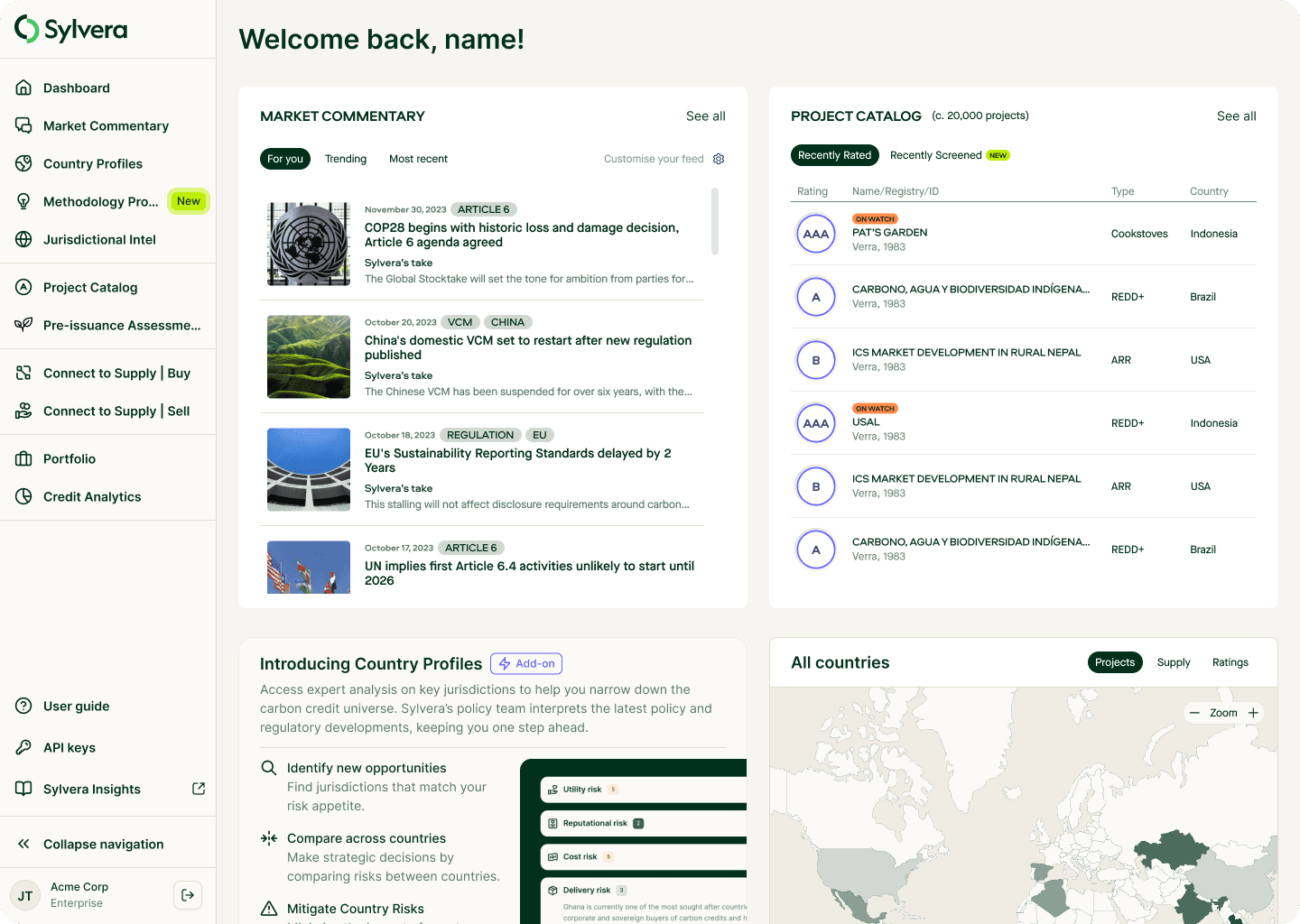
Navigating Sylvera was confusing, disjointed, and hid valuable features, making it harder for users to access our growing suite of products. This directly impacted user retention, feature adoption, and revenue opportunities—especially for add-ons like Profiles, Jurisdictional Intel, and CCA.
The Challenge
Poor product discoverability meant users struggled to find new tools, limiting upgrades and revenue.
The dashboard functioned as a homepage, ad board, and navigation system—all poorly.
Engineering time was wasted building complex dashboard tiles instead of intuitive navigation.
User frustration and inefficiency due to a lack of clear structure and hierarchy.
The Solution: A Unified Navigation System
To streamline UX, improve discoverability, and reduce tech debt, we introduced a persistent side navigation, ensuring:
Consistent navigation access across all pages, removing friction and improving efficiency.
Collapsible side navigation, giving users flexibility in how they interact with the UI.
Improved content hierarchy and product visibility, making upgrades and new features easy to find.
More focused dashboard, shifting from cluttered navigation functions to actionable insights like carbon portfolio monitoring, project updates, and market trends.
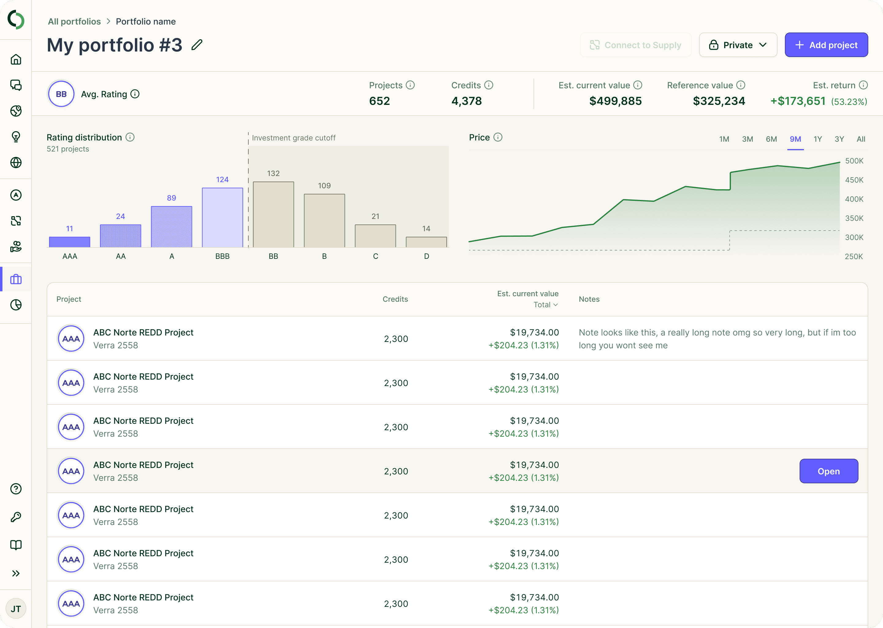
Progressive disclosure, we allowed the nav to react to the type of page you are on, the deeper down inside the portal you go the less you need the context of the side nav, for example if you click into a project page. Project Catalog > Project > Project page, you will be more interested in the project page information that the navigation so we auto colapse to give the user more space for information.
By prioritizing Jakob’s Law and best-practice design patterns, we created a familiar yet powerful experience that helps users take climate action faster, access critical data effortlessly, and get more value from Sylvera.
Results & Feedback
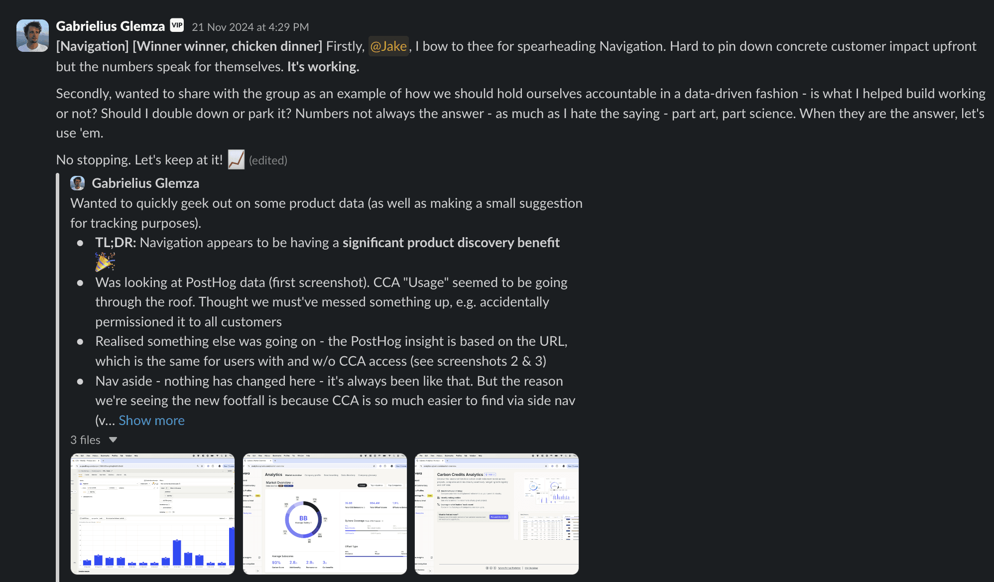
We have made the app easier to navigate - have seen each area of the product usage instantly spike and stay consistently higher than it did before.