A collection of images and short descriptions of the Sylvera app before and after I worked on them
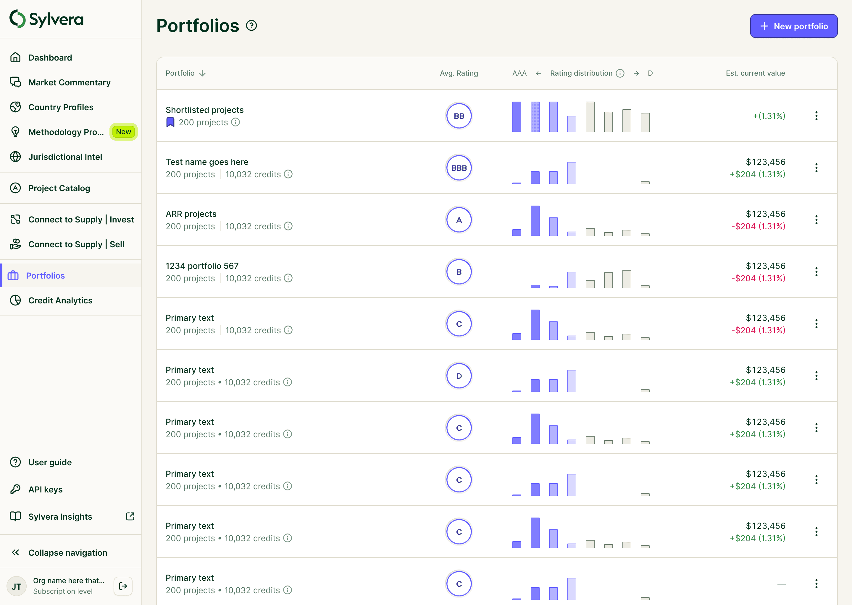
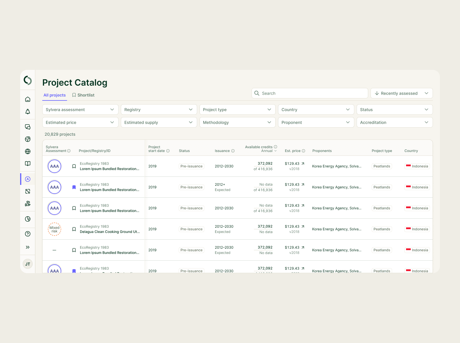
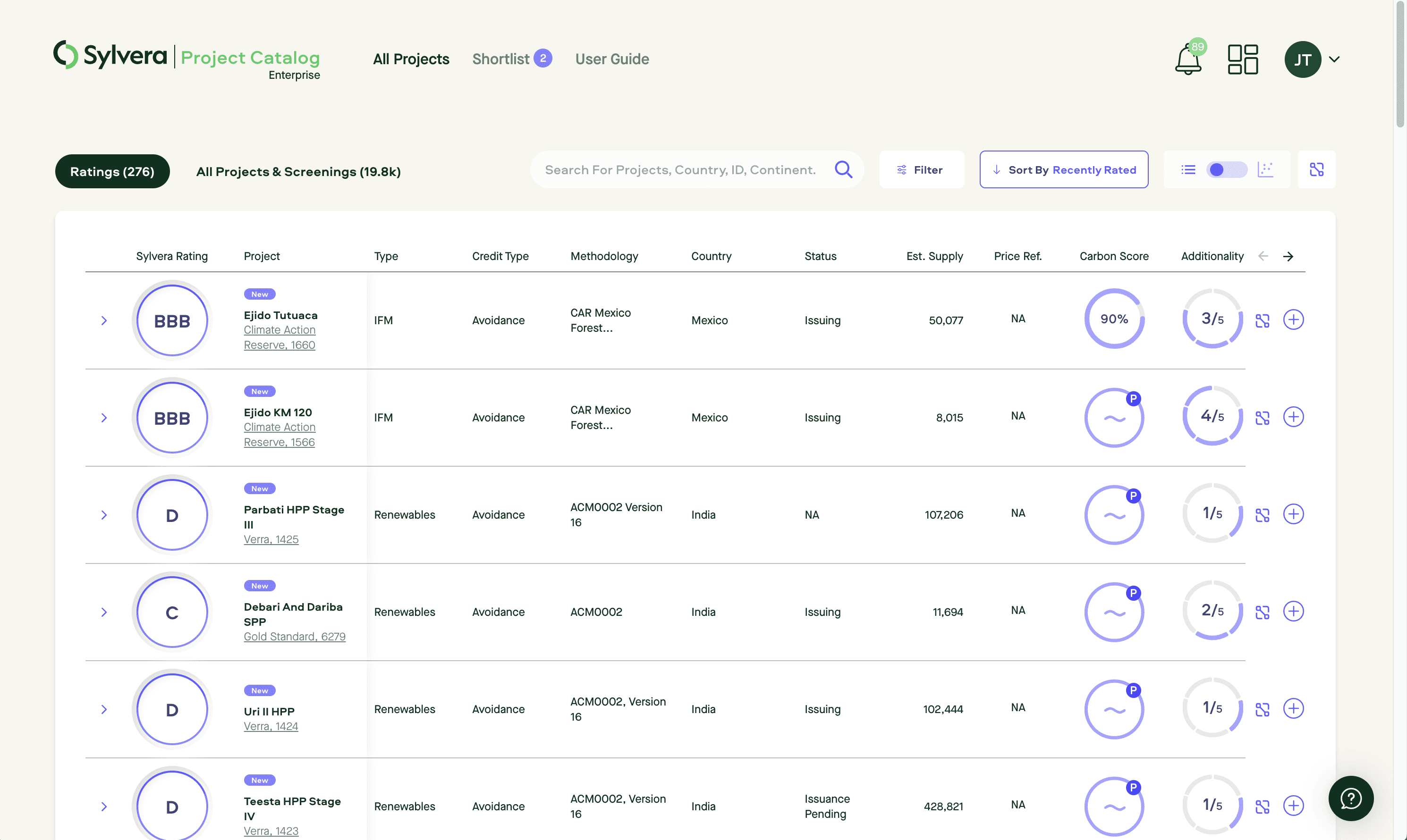
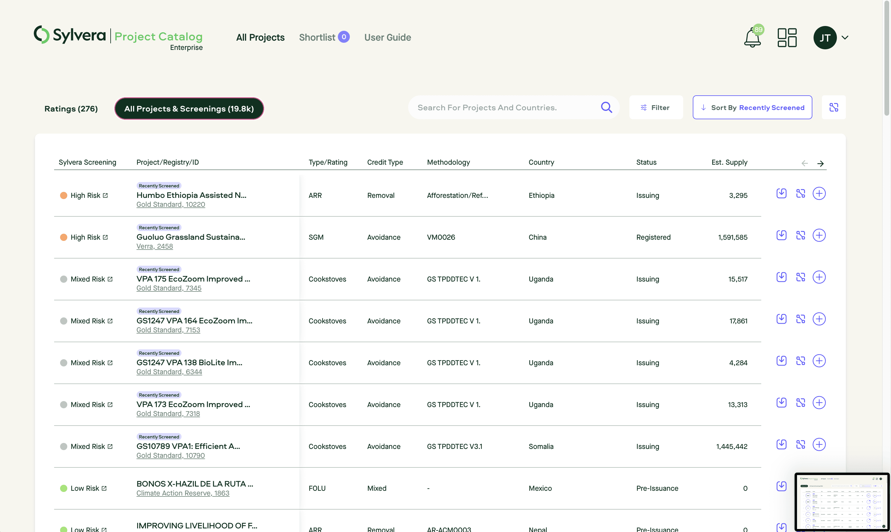
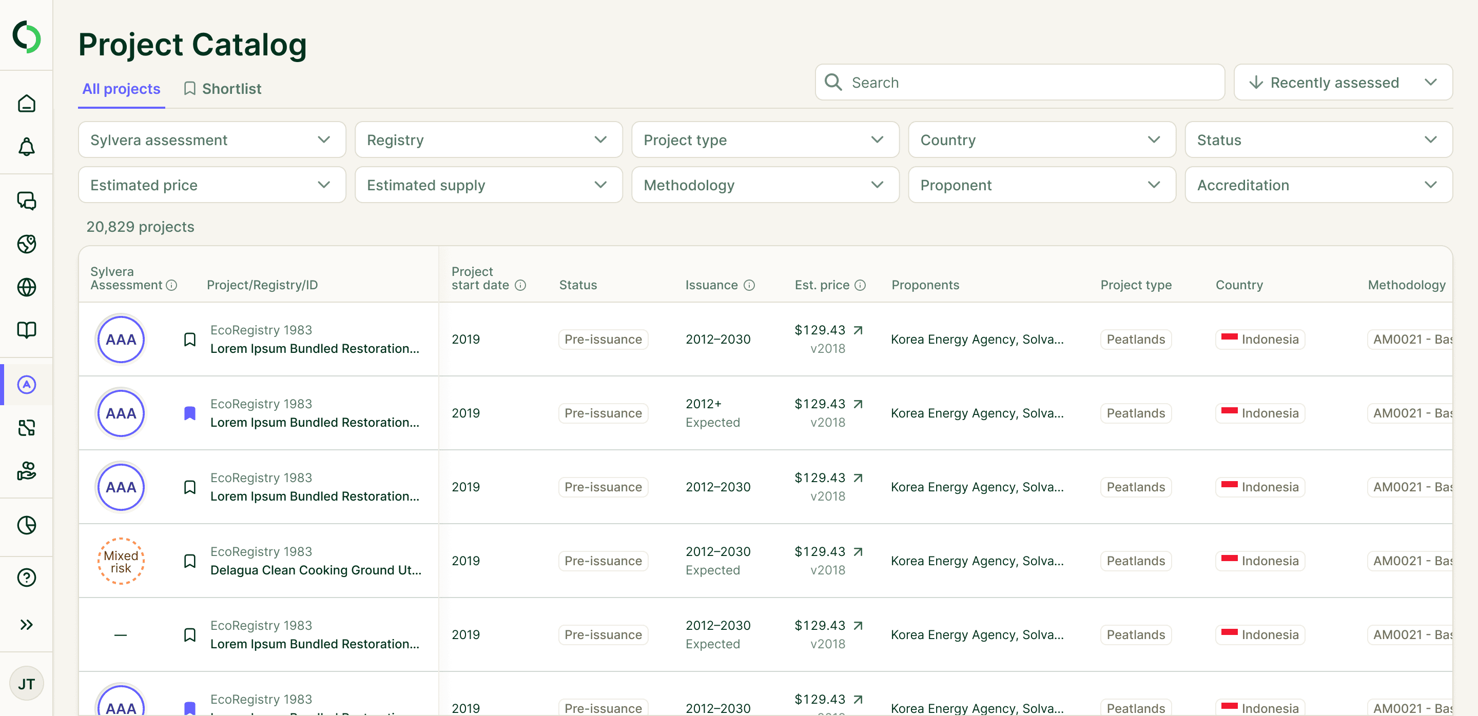
Project Catalog
The Project
Sylvera’s Project Catalog serves as a library of assessed carbon projects, helping users search, filter, and navigate the carbon credit universe. However, the experience was slow, over-engineered, and difficult to use, making it harder for users to find relevant projects efficiently.
The Solution
We redesigned the Project Catalog using design system components, improving performance and usability. Filters were moved directly onto the page for easier refinement, the UI was cleaned up, and data was reorganized to surface the most relevant insights. The result? A faster, more intuitive experience that helps users find and assess carbon credits with ease.
Before
After
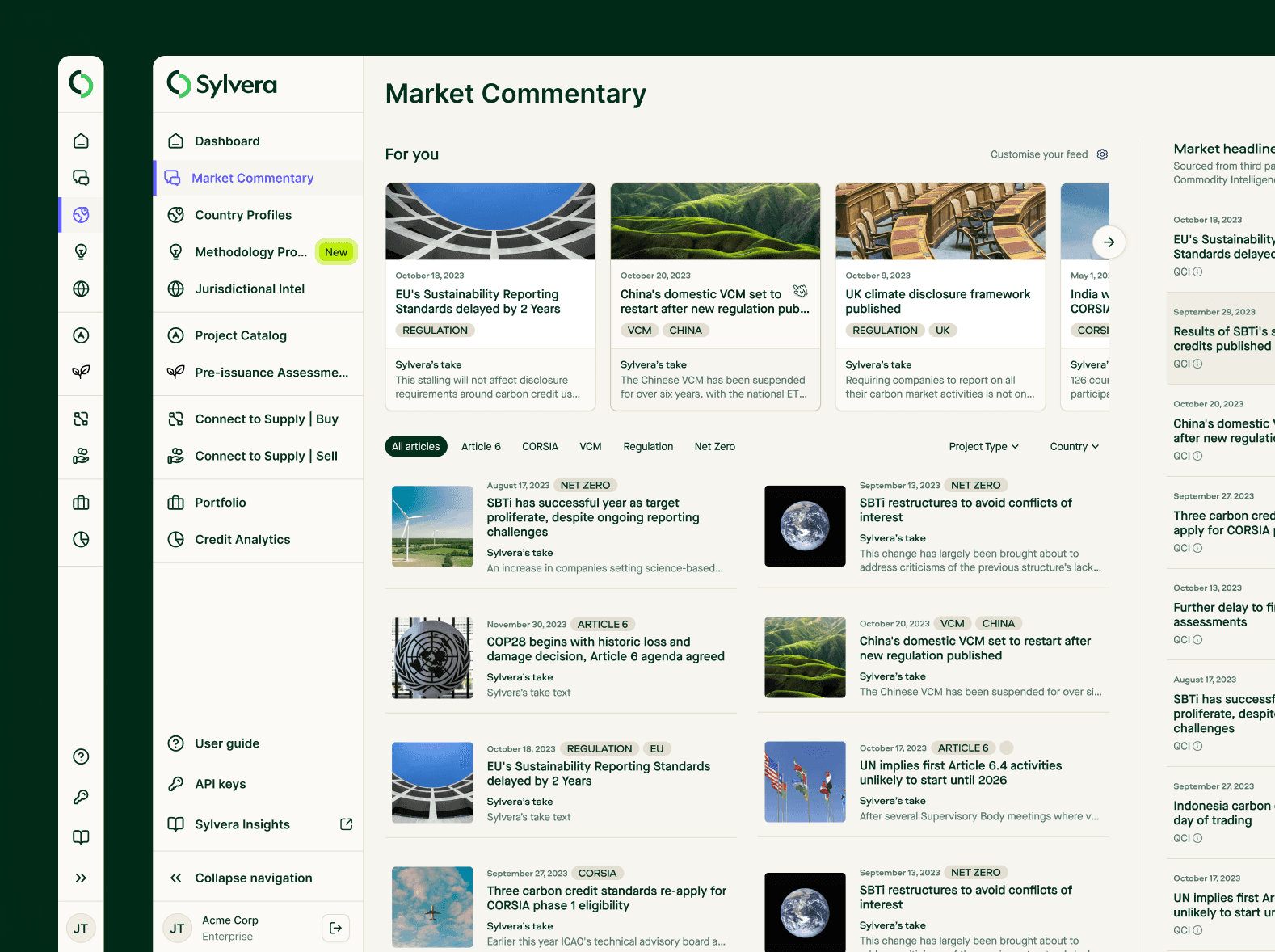
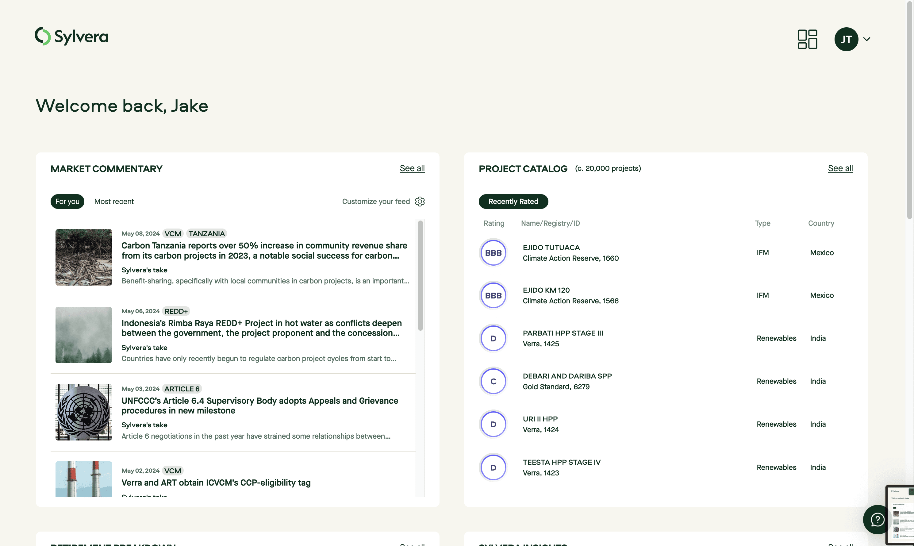
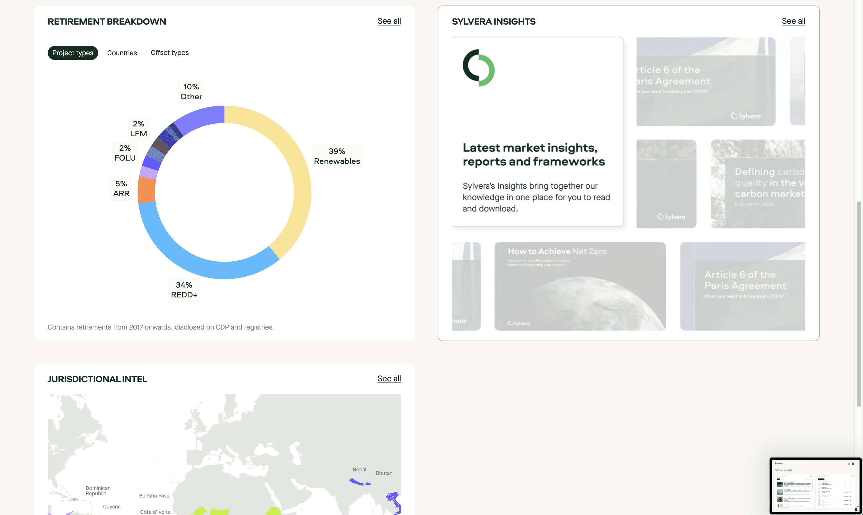
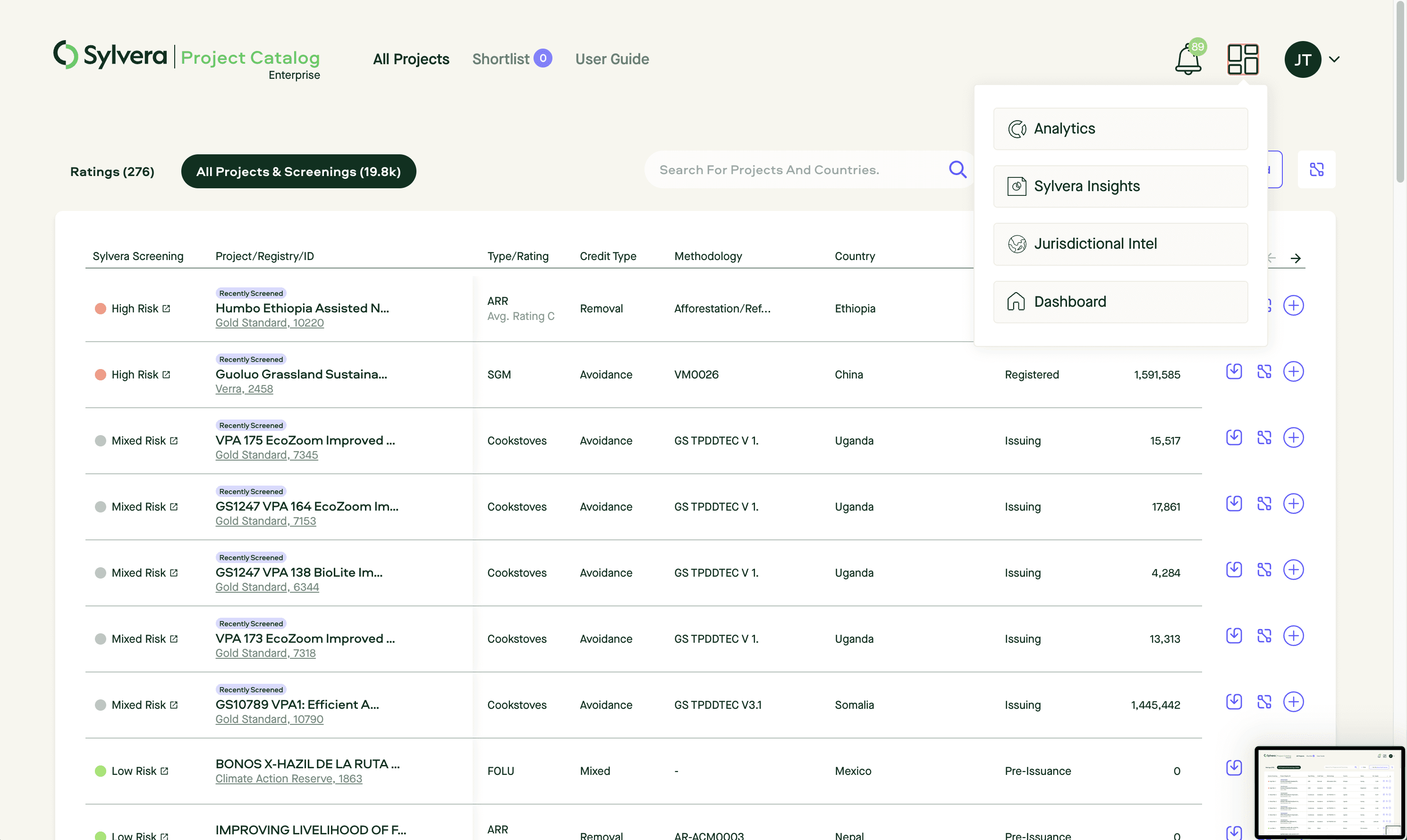
Navigation
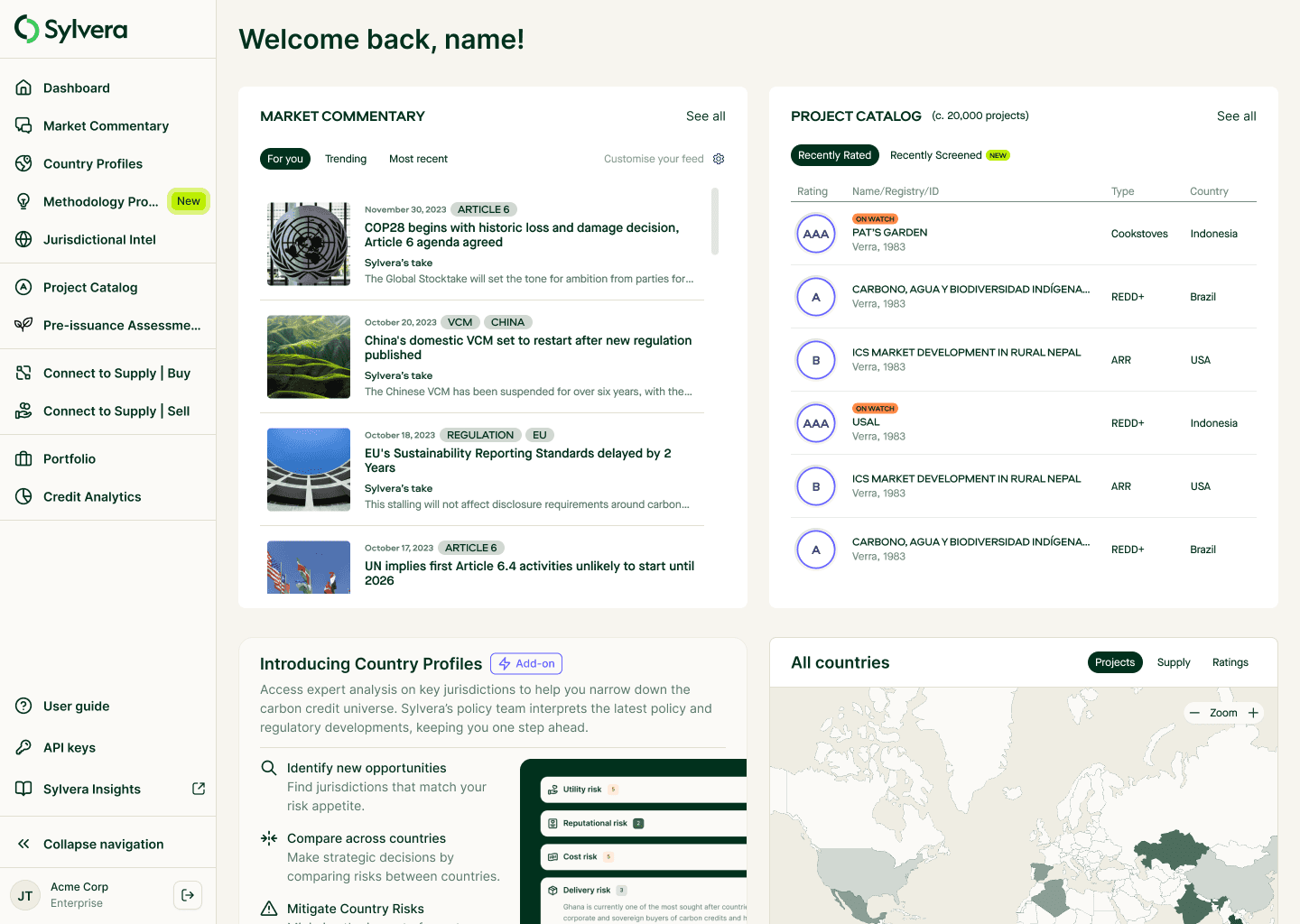
The Project
To scale the Sylvera App while ensuring a seamless, unified experience, we needed a better navigation system—one that made it easier for users to define and act on their carbon strategy. The existing hidden navigation and homepage tiles made the app feel disjointed and difficult to navigate, limiting product visibility.
The Solution
We introduced a persistent side navigation, creating a cohesive, scalable structure that makes navigating the app faster and more intuitive. This new system also highlights new features, ensuring users can easily discover Sylvera’s expanding capabilities. [Read more about navigation here →]
Read more about navigation here
Before
After